
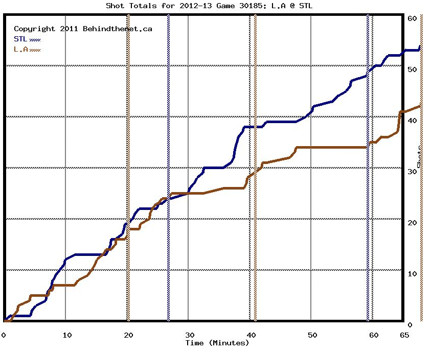
Shot Chart

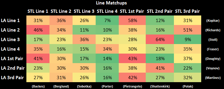
Matchup Charts

(Players in parenthesis selected as proxies to represent their units. The way to read it is: The Kings 1st line spent X% of their time against the opponents first line, etc. Red = more time against. Green = less time.)

(The way to read this one is: The Kings’ 1st line was on ice for X shot attempts against the opponents first line, etc. Red = more zone time against. Green = less time.)